


Gray Paint's Evolving Role: Designers Share Top Picks for Timeless Appeal
Gray paint's popularity wanes, but experts reveal its enduring charm. Discover seven designer-approved shades that balance sophistication and warmth, defying the "millennial gray" stereotype.
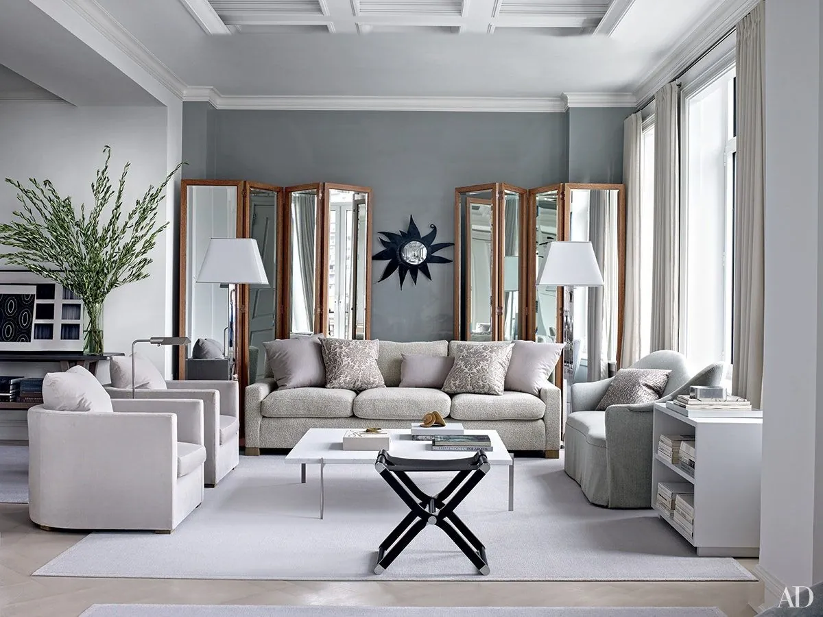
The once-ubiquitous gray paint is facing scrutiny, particularly from Gen Z, who often criticize "millennial gray" on social media platforms. However, design professionals argue that when chosen thoughtfully, gray can still offer timeless appeal and versatility in interior spaces.
Kristin Harrison, founder of Bungalow 10 Interiors, acknowledges the shift in perception: "Gray has been prevalent for the past five to six years, potentially dating spaces." However, she emphasizes the importance of selecting grays with nuanced undertones, such as violet or green, to avoid a cold or uninviting atmosphere.
Gray's enduring qualities make it a valuable choice for open-plan living areas and bathrooms, where tranquility is often desired. Its sophistication as a backdrop for vibrant artwork and antiques also contributes to its continued relevance.
Here are seven gray paint colors favored by professional designers:
Benjamin Moore's Chelsea Gray: A chameleon-like shade with taupe and violet undertones, offering versatility in various lighting conditions.
Farrow & Ball's Pavilion Gray: Featuring subtle blue notes, this shade adapts to its surroundings throughout the day.
Benjamin Moore's Kendall Charcoal: A saturated gray suitable for contemporary spaces, particularly effective when paired with light wainscoting.
Benjamin Moore's Wickham Gray: A soft, cloud-like shade that brings airiness to living spaces.
Behr's Silver Polish: A clean, fresh backdrop with a touch of warmth, ideal for utility spaces like laundry rooms.
Farrow & Ball's Hardwick White: A complex shade with depth and subtle warmth, suitable for various design styles.
Farrow & Ball's Lamp Room Gray: Inspired by lamp wick stains, this contemplative shade works well as an accent color.
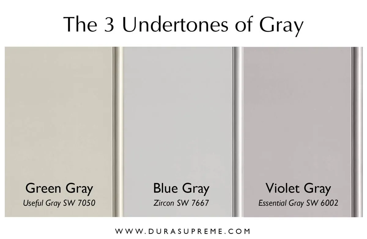
The key to successfully incorporating gray lies in understanding its nuances and potential impacts on a space. The human eye can distinguish approximately 500 shades of gray, highlighting the importance of careful selection. Gray's perception can vary significantly based on lighting conditions, making it crucial to test samples in the intended environment.
Gray's versatility extends beyond interior design. Its use in corporate settings often conveys professionalism, while in minimalist and modern design styles, it creates a sense of balance. In architecture, gray is frequently employed to harmonize buildings with their surroundings.
The color's influence reaches various industries, including fashion and automotive design, where it signifies elegance and sophistication. In digital design, gray's readability and versatility make it a popular choice for user interfaces and typography.
While the "millennial gray" trend may be fading, the thoughtful use of gray in interior design continues to offer timeless appeal. By selecting shades with rich undertones and considering the interplay of light and space, designers and homeowners can create sophisticated, tranquil environments that stand the test of time.
"Neutral can go in so many directions, but for me, it's about how the color reflects, absorbs and accentuates natural light in a room. I love when a paint color surprises you from hour to hour and almost adapts to its surroundings."
As the design world evolves, gray paint remains a valuable tool in the designer's palette, offering a foundation for creativity and a canvas for personal expression. The key lies in selecting the right shade and application to create spaces that are both current and enduring.