


Designers Embrace Bold Hues: A Guide to Vibrant Interior Paint Choices
Interior designers challenge color fears, offering insights on incorporating vibrant paint shades. From mustard ceilings to cobalt woodwork, experts share tips for creating cohesive, eye-catching spaces.
Interior design experts are challenging the notion that bold paint colors are overwhelming, encouraging homeowners to embrace vibrant hues for a unique and captivating living space. While many individuals hesitate to use strong shades, designers argue that these colors can bring unexpected mood and character to a room, especially in an era dominated by neutral interiors.
Tami Ramsay, partner and principal designer of Cloth & Kind, suggests a harmonious approach to incorporating bold colors. She recommends echoing the vibrant wall or cabinet hue in other design elements, such as fabric patterns or accessories, to create a cohesive look. This strategy helps prevent the bold color from feeling isolated or jarring within the space.
For those interested in experimenting with more daring paint choices, designers offer several recommendations:
Peristyle Brass by Sherwin-Williams: Drew Michael Scott of Lone Fox applied this mustardy shade to a bedroom ceiling, drawing inspiration from the Arts & Crafts movement and amber glass prevalent in Spanish revival homes.
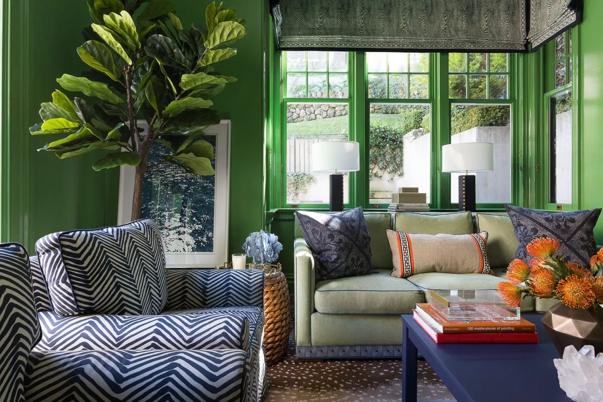
Napa Vineyards by Benjamin Moore: Ramsay used this vibrant green for built-ins in a Georgia bedroom, complementing the natural surroundings visible through the windows.
Red by Benjamin Moore: Designer Ghislaine Viñas chose this classic red for an Aspen powder room, creating a striking contrast with the home's otherwise architectural and light-toned spaces.
Roycroft Adobe by Sherwin-Williams: Aly Velji selected this bold hue for a laundry and mudroom in Calgary, Alberta, demonstrating that utilitarian spaces can benefit from unexpected color choices.
Eating Room Red by Farrow & Ball: Scott applied this softer red in high gloss to hallway woodwork and doors, creating a striking yet transitional space.
Fire Dance by Benjamin Moore: Mara Miller of Carrier and Company Interiors matched this orange shade to fabric in a Long Island cottage outbuilding, enhancing the space's charm and coziness.
Van Buren Brown by Benjamin Moore: Scott chose this rich brown with subtle purple undertones to complement Monet marble in a kitchen, showcasing how undertones can add depth to a color.
Drawing Room Blue by Farrow & Ball: Miller used this vibrant cobalt for woodwork in a Brooklyn townhouse, praising its energetic yet rich appearance.
Tucson Coral by Benjamin Moore: Designer Gray Walker applied this perfect coral in a Charlotte butler's pantry, connecting it to the adjacent navy blue dining room.

Designers emphasize that factors such as natural light, room size, and personal preferences play crucial roles in selecting and implementing bold colors. They encourage homeowners to consider the relationship between the chosen hue and other elements in the space, including fabrics, accessories, and even views from windows.
"You're not really living in it, but it's more of a fun transitional area."
By incorporating these expert tips and color recommendations, homeowners can overcome their hesitation and create visually striking, personalized interiors that stand out from the crowd of neutral spaces.